
What Is Abstract Pond Painting (and How Can It Transform Your Water Garden)?
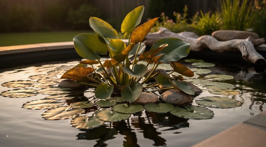
Abstract pond painting transforms your water garden into a living canvas where plants, textures, and colors replace traditional brushstrokes and pigments. Instead of creating artwork on paper or canvas, you design the pond itself as an artistic composition, treating aquatic plants as your palette and natural materials like rocks, driftwood, and gravel as textural elements that shift with seasons and light.
This approach has gained momentum among water gardeners who want something more expressive than the rigid formality of traditional koi ponds or the predictable symmetry of ornamental fountains. You’re not just maintaining a functional ecosystem. You’re composing a scene that changes throughout the day as sunlight moves across the water and plants sway in the breeze, creating an ever-evolving piece of outdoor art.
The practical appeal is straightforward: abstract pond painting gives you permission to break free from conventional design rules. Asymmetry becomes an asset. Unexpected plant combinations add visual interest. That oddly shaped rock you couldn’t figure out where to place suddenly becomes a focal point rather than a problem to solve.
In this guide, you’ll learn how to think like an artist while keeping your pond healthy for fish and plants. We’ll walk through the core principles that make abstract pond design work, explore different stylistic approaches you can adapt to your space, and tackle the practical considerations that keep your artistic vision thriving year-round. Whether you’re starting from scratch or reimagining an existing pond, the techniques here will help you create a water feature that feels uniquely yours.
What Abstract Pond Painting Really Means
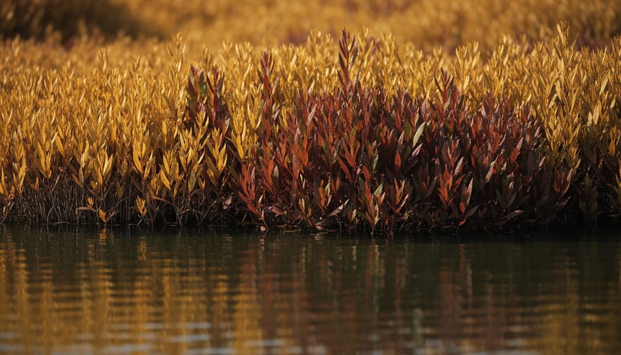
Abstract pond painting isn’t about hanging artwork near your water feature. It’s a design philosophy that treats your pond itself as a living canvas, where you arrange aquatic plants, substrate colors, rocks, and even water clarity to create deliberate visual effects rather than replicating nature or following rigid formal patterns.
Think of it this way: instead of placing plants because “that’s where they’d grow in the wild” or arranging them in symmetrical rows, you position them for their color impact, their textural contrast, or the way they create movement across the water surface. A cluster of red-stemmed ludwigia becomes a bold brushstroke. Golden creeping jenny sprawling over dark gravel creates a striking color block. Water depth affects plants differently, so you can use depth variations to control where certain foliage appears, essentially painting with elevation.
This approach differs sharply from formal pond design, which relies on symmetry, geometric shapes, and predictable plant placement. It also diverges from naturalistic design, which aims to mimic wild wetlands or streams. Abstract pond painting borrows from both but prioritizes artistic expression, you’re creating mood, visual interest, and a unique composition that reflects your personal aesthetic.
- Color blocking
- Using distinct zones of single plant colors or substrate tones to create bold visual boundaries, like an area of all-yellow blooms next to deep green foliage.
- Textural layering
- Combining plants with different leaf shapes and surface qualities, spiky, rounded, fine, bold, to add depth and visual complexity to your pond composition.
- Focal points
- Strategic placement of eye-catching elements like a vibrant plant cluster, distinctive rock, or water feature that draws attention and anchors your design.
- Visual flow
- The way your eye naturally moves across the pond surface, guided by plant arrangement, color transitions, and hardscape placement rather than random scattering.
The beauty of this approach is that it gives you creative freedom. You’re not bound by “правильно pond rules” about native plants or natural habitat zones. Your only constraint is what thrives in your water conditions, and how you arrange those elements to create something visually striking that makes you stop and stare.
How Abstract Pond Painting Works in Your Water Garden
The Color Palette: Plants and Materials
Your plant and material choices are the literal colors on your abstract pond palette. Think beyond “just green”, aquatic plants offer an extraordinary range of foliage hues, from chartreuse and gold to burgundy, silver, and near-black.
Golden creeping jenny (Lysimachia nummularia ‘Aurea’) creates luminous yellow-green sweeps against dark river gravel, while variegated sweet flag iris (Acorus calamus ‘Variegatus’) adds crisp white-striped vertical strokes. For dramatic accent work, red-stemmed plants like certain ludwigia species or copper-toned water lilies provide the bold punctuation marks your composition needs.
Substrate color matters enormously. Black pebbles deepen water appearance and make bright plants pop. Light tan gravel creates a softer, sun-drenched mood. You can even section your pond bottom with different substrate colors, charcoal in deep zones transitioning to honey-colored stones in shallows.
The power of contrast amplifies every color choice. A single clump of burgundy-leaved water canna against pale limestone rock becomes a focal point. Silver-backed floating heart leaves shimmer against dark water.
Start with three to five colors maximum for your first abstract design. Too many hues create visual noise rather than artistry. As you gain confidence, you’ll develop an eye for which combinations sing and which ones clash in your specific light conditions.
Brushstrokes: Textures and Forms
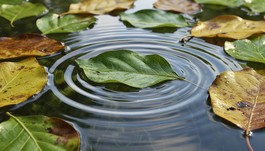
In abstract pond painting, texture acts as your brushwork, creating rhythm, depth, and visual energy across the water’s surface and margins. Fine-textured plants like hair grass or parrot’s feather create delicate, wispy strokes that soften edges and add movement. Bold, architectural foliage from plants like elephant ear or umbrella palm functions as thick, confident strokes that anchor your composition and draw the eye.
Spiky forms, think iris leaves or horsetail, introduce vertical lines that punctuate the design, much like decisive upward strokes in expressionist painting. Rounded, billowing plants such as water lettuce or floating heart create softer, circular masses that balance the sharper elements. The real magic happens when you layer these textures deliberately: feathery grasses in the foreground, bold leaves mid-composition, and spiky accents as focal points.
Growth patterns matter too. Spreading groundcovers like creeping jenny create horizontal sweeps, while upright rushes add vertical drama. Expert aquascaping often combines three to five distinct textures to avoid monotony while maintaining visual coherence. Step back regularly and view your pond from different angles, just as a painter steps away from the canvas, to see where textures clash or where adding contrast would strengthen the overall composition.
Artistic Styles You Can Create
Minimalist Water Canvases
Minimalist water canvases strip pond design down to its essentials, think three plant varieties maximum, plenty of open water, and intentional emptiness that lets each element breathe. This approach works beautifully in small ponds where too many plants create visual chaos, and in contemporary landscapes where simplicity makes a stronger statement than abundance.
A classic minimalist setup might feature just a single cluster of white-flowering water lilies against dark water, with smooth river stones along one edge and nothing else. The restraint creates calm. Or you might choose one vertical accent plant like dwarf papyrus, paired with low-growing dwarf four-leaf clover covering perhaps a quarter of the surface, leaving the rest as reflective negative space.
The power comes from what you leave out. Every plant placement becomes deliberate, a carefully chosen brushstroke rather than random coverage. This style demands less maintenance than busy designs and helps small ponds feel larger through visual simplicity.
Bold Color Blocking
Color blocking in pond design is all about making bold, deliberate choices that grab attention. Instead of mixing plants randomly, you create dedicated zones where one color or texture dominates completely. Picture a sweeping arc of golden marsh marigolds filling one corner, while the opposite side features nothing but deep burgundy-leafed lobelia. The contrast hits you immediately.
This approach works beautifully in medium to large ponds where you have room to establish these distinct areas. Try clustering bright yellow flag iris along one edge, then transition sharply to a bank of pure white calla lilies. The defined boundaries between color zones create visual drama that shifts as you walk around the pond.
For maximum impact, limit yourself to two or three bold colors and resist the urge to blend them. Let each zone breathe on its own. The water itself becomes negative space that separates and defines each color block, making your living artwork pop.
Impressionistic Blends
This approach mimics the soft, hazy quality of impressionist paintings by letting colors and textures blur together naturally. You’ll choose plants with overlapping bloom times and complementary hues that blend rather than contrast sharply. Think pink water lilies surrounded by purple pickerel weed that fades into pale yellow iris, all against a backdrop of varying green foliage.
The key is layering plants at different heights and distances so they create depth when viewed from your main vantage point. Allow plants to intermingle at their edges instead of maintaining strict boundaries. Pale water primrose can drift into darker water celery, while floating plants like water lettuce soften the transitions between planted zones.
This style works beautifully for medium to larger ponds where you have space to create gradual shifts. The effect changes with lighting conditions throughout the day, just like an actual impressionist painting, giving you a water garden that feels romantic and slightly mysterious.
Geometric and Structured
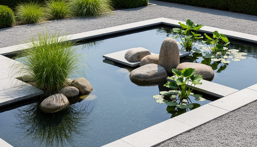
Geometric abstract designs bring architectural precision to water gardens. This approach uses straight-edged stepping stones, rectangular planters, circular stone borders, and deliberately pruned plants to create shapes that contrast with water’s organic nature.
Container plants work beautifully here, arrange square or cylindrical pots in repeating patterns along your pond edge, each holding a single plant variety for visual unity. Floating ring planters create perfect circles on the surface, while wooden grids or metal frames submerged just below waterline establish structured zones for plant growth.
Control is key: trim bog plants into uniform heights, space irises at measured intervals, or use dividers to maintain distinct plant sections. The tension between geometric hardscape and living elements creates striking abstract compositions that feel both modern and intentional.
Where and How to Apply Abstract Pond Painting
Abstract pond painting works beautifully in virtually any water feature, though certain situations let you maximize its impact. The technique adapts to your pond’s purpose, size, and viewing angles, you don’t need a sprawling estate pond to create something visually stunning.
New pond construction gives you the cleanest canvas. You can design your abstract composition from the ground up, selecting substrate colors, hardscape placement, and plant zones without working around established layouts. If you’re planning a pond right now, think about your primary viewing angle (from the patio? a deck? a pathway?) and design your color blocks and textures to shine from that perspective.
Existing ponds welcome abstract redesigns too. You might keep your basic structure and liner but rethink plant placement entirely, pulling out the traditional ring-around-the-edges approach and creating intentional color zones instead. Fall or early spring offers ideal timing for this transformation, when you can divide and relocate plants without heat stress.
This approach particularly shines in:
- Small urban ponds where every plant choice matters and you want maximum visual impact in limited space
- Viewing ponds designed for contemplation rather than fish-focused systems where plant density might limit oxygen
- Patio water features and raised ponds with distinct viewing angles that benefit from planned compositions
- Wildlife ponds where you’re balancing ecological function with artistic flair and want something more interesting than random plant scatter
Container water gardens and whiskey barrel ponds actually make perfect practice canvases. You can experiment with color blocking or minimalist arrangements on a small scale before committing to larger pond redesigns. The shallow depth and contained space force you to think critically about each element, exactly the mindset abstract pond painting requires.
Size doesn’t determine success here. A two-by-three-foot preformed pond can showcase bold color blocking just as effectively as a thousand-gallon custom build. What matters is intentionality: viewing your water feature as a composition rather than just a collection of plants.
Getting Started: Your First Abstract Pond Design
You don’t need to start from scratch or tear out your existing pond. The easiest entry point is working with what you already have and making small, intentional changes that build toward a cohesive vision.
Start by observing your pond at different times of day. Walk around it, noting which angles offer the best views. Your abstract composition should be designed for these primary viewing points, not for an imaginary bird’s-eye perspective. Take photos from where you’ll actually see the pond, your patio, kitchen window, or garden path, and sketch simple shapes on printouts to plan color zones.
Choose three to five elements maximum for your first design. This might be two plant colors, one substrate tone, and a single hardscape material. Limiting your palette prevents chaos and helps you understand how elements interact before expanding. A beginner-friendly combination could be golden lysimachia, dark purple lobelia, and light river stones, simple, but visually striking when arranged with intention.
Work in phases rather than executing everything at once. Plant one color zone this month, add contrasting textures next month, then assess what’s working before continuing. This gradual approach lets you see how plants establish, how colors shift through seasons, and where adjustments feel natural. It’s also far less overwhelming than a complete overhaul.
Consider seasonal progression as part of your composition. Spring yellows might give way to summer purples, then autumn oranges in marginal foliage. Plan for this evolution rather than fighting it, abstract pond painting celebrates change as part of the artwork. Choose at least one evergreen element to anchor your design through dormant periods.
Start small if your pond allows it. Dedicate one section, perhaps a corner or shallow shelf, to your abstract experiment while leaving the rest as-is. This low-risk zone lets you practice the artistic approach where art meets water without committing your entire feature. Once you’re confident in the results, expand the technique to other areas.
Finally, give yourself permission to adjust. Unlike canvas paintings, pond compositions can be edited, plants moved, and stones rearranged. Your first attempt teaches you what works in your specific conditions, water chemistry, light levels, fish behavior, and that knowledge makes your second iteration even better.
Common Questions About Abstract Pond Painting
Is Abstract Pond Painting Right for Your Water Garden?
Many pond owners worry that an abstract design approach might clash with practical needs or prove too complex. The reality is that abstract pond painting adapts to nearly any water feature and skill level, once you understand how it fits your specific situation.
Does abstract pond painting work with koi or goldfish?
Absolutely. Water quality supports fish health regardless of artistic style, and abstract designs often improve viewing angles for watching your koi move through color zones. Just ensure your plant choices don’t overcrowd swimming space or compromise filtration access.
How much maintenance does an abstract pond design require?
No more than traditional ponds, sometimes less. Bold color blocking with low-maintenance perennials actually simplifies upkeep compared to fussy formal gardens, and you’re free to let plants grow naturally rather than constantly pruning to rigid shapes.
Will my abstract design look good year-round?
With smart plant selection, yes. Include evergreen or winter-interest species, work with substrate colors that shine through sparse growth, and consider strategic pond lighting to highlight textures and reflections during dormant months.
Is this approach expensive?
It can be as budget-friendly as you make it. Start with a few impactful plant groupings and work with existing hardscape, you’re not obligated to rebuild your entire pond.
Can beginners try abstract pond painting?
Definitely. This approach is actually more forgiving than formal designs because there’s no “wrong” placement, you’re creating your own composition rather than following strict rules.
The beauty of treating your pond as a living canvas is the freedom it offers. You can start small, experiment boldly, and adjust your design as plants mature and your artistic vision evolves.
Your pond doesn’t have to follow anyone’s rules but your own. Abstract pond painting gives you permission to experiment, play with color and texture, and watch your vision come alive with each season. Whether you plant three varieties or thirty, arrange them in bold blocks or soft drifts, you’re creating something that shifts and grows and surprises you.
Start small if you’re new to this approach. Pick one area to redesign. Try a color combination that excites you. Notice how light hits the water at different times of day. The beauty of treating your pond as a living canvas is that it’s never truly finished. Plants grow, blooms fade and return, and your artistic eye sharpens with experience.
This isn’t just pond maintenance anymore. It’s water gardening as creative expression, where every choice adds another layer to your outdoor masterpiece.