
Transform Your Pond’s Magic: Using Light Colors to Create Stunning Night Displays
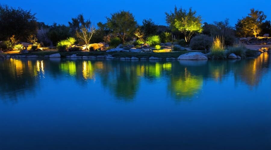
Color transforms the way we experience light and space, turning ordinary pond features into captivating nighttime displays. Understanding lighting color theory isn’t just about aesthetics—it’s about creating emotional connections and highlighting the natural beauty of your water feature. When light interacts with water, it creates a dynamic interplay that can dramatically enhance your pond’s atmosphere, from the subtle shimmer of blue lights evoking tranquil ocean depths to warm amber tones that mirror the golden hour’s magic.
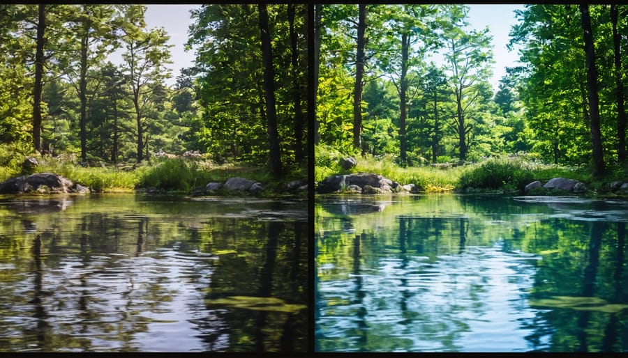
The science behind lighting color theory reveals why certain hues work better in aquatic environments. Cool whites and blues penetrate water more effectively, making them ideal for illuminating deeper areas, while warm yellows and oranges excel at highlighting surface features and surrounding landscaping. This knowledge empowers pond owners to make informed choices that transform their outdoor spaces into enchanting nighttime retreats.
Whether you’re designing a new pond lighting system or upgrading an existing one, mastering color theory principles will help you create the perfect balance of functionality and visual appeal. Let’s explore how strategic color choices can enhance your pond’s natural features while creating the exact mood and atmosphere you envision for your outdoor sanctuary.
The Science Behind Color and Water
Light Penetration and Water Depth
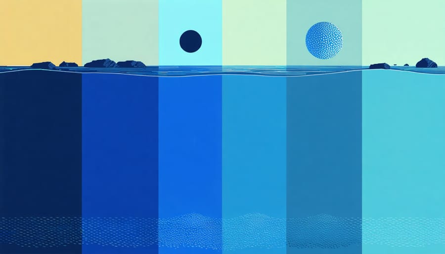
When it comes to underwater landscape lighting, understanding how light behaves at different depths is crucial for creating stunning effects. Light penetrates water differently depending on its color, which directly impacts your pond’s visual appeal.
Blue and green lights penetrate water most effectively, reaching deeper areas of your pond while maintaining their brightness. This is why these colors are perfect for highlighting deep-water features or creating an ethereal underwater glow. Red light, on the other hand, gets absorbed quickly and is best used in shallow areas or near the surface for dramatic effects.
White light, while versatile, loses intensity as it travels through water. At about 3-4 feet deep, white light begins to take on a bluish tint due to water’s natural filtering properties. For the best results in deeper waters (5+ feet), opt for higher-intensity lights or stick with blue-green tones.
Consider using different colored lights at various depths to create layers of illumination. Place warmer colors like amber and red in shallow areas, and save your blue and green lights for deeper zones where their superior penetration can really shine.
Color Temperature Basics
Color temperature plays a crucial role in how your pond appears during evening hours. In lighting, we describe temperature using Kelvins (K), but don’t let the technical term intimidate you – it’s simply a way to measure how warm or cool a light appears to our eyes.
Warm lights (2700K-3000K) cast a cozy, golden glow that reminds us of sunset. These lights make your pond feel inviting and intimate, perfect for creating a relaxing atmosphere during evening gatherings. They’re particularly flattering for ponds with red, orange, or yellow water lilies, and they make koi with warm-colored scales really pop.
Cool lights (5000K-6500K), on the other hand, produce a crisp, bright white light similar to daylight. These lights work wonderfully to showcase clear water and create a more natural, moonlit appearance. They’re excellent for highlighting blue or purple water plants and making your pond’s water features sparkle with clarity.
For the most dynamic display, consider using both warm and cool lights in different areas of your pond. This combination can create depth and visual interest while maintaining a balanced, natural appearance.
Creating Mood with Color
Warm Colors: Cozy and Intimate
Warm-colored lighting can transform your pond into one of the most intimate and dazzling aquatic displays in your garden. These cozy hues, ranging from soft yellows to deep reds, create an inviting atmosphere that’s perfect for evening entertainment or quiet reflection.
Yellow lighting brings a gentle, sunlit quality to your pond, making it feel naturally warm and welcoming. It’s particularly effective when used to highlight water features or illuminate gathering areas around the pond. Orange tones add a sunset-like glow that creates a perfect transition between daylight and evening, making your pond area feel like a peaceful retreat.
Red lighting, while bold, can create stunning effects when used sparingly. Try positioning red lights near architectural features or using them to accent specific plants around your pond. The key is to layer these warm colors thoughtfully – perhaps using yellows as your base lighting, with touches of orange and red for dramatic effect.
For the best results, consider placing warm-colored lights at different heights and angles. You might illuminate water features from below with yellow light, while using orange uplighting on nearby trees or structures. This creates depth and dimension, making your pond area feel like a cozy outdoor room rather than just a lit water feature.
Cool Colors: Serene and Mysterious
Cool colors like blues and greens create a magical underwater atmosphere in your pond, perfectly complementing the natural environment. These serene hues work wonderfully because they mirror the colors already present in nature, making your water feature feel like a seamless part of the landscape.
Blue lighting creates a sense of depth and tranquility, reminiscent of deep ocean waters. When you use blue lights in your pond, they can make the water appear clearer and more mysterious, especially during evening hours. Try positioning blue lights near water features like fountains or waterfalls to enhance their dramatic effect.
Green lighting brings a natural, forest-like quality to your pond space. It’s particularly effective when used to illuminate surrounding plants and foliage, creating a harmonious transition between your pond and garden. Consider using soft green lights to highlight aquatic plants or to create gentle shadows on the water’s surface.
For the most natural look, combine different intensities of these cool colors. You might use deeper blues in the pond’s deeper areas and lighter aqua tones near the edges. When working with green lights, softer tones work best to avoid an artificial appearance.
Remember that cool colors tend to recede visually, making your pond appear larger and more mysterious. They’re also less likely to disturb nocturnal wildlife, making them an excellent choice for maintaining your pond’s ecosystem.
Practical Color Combinations
Complementary Colors
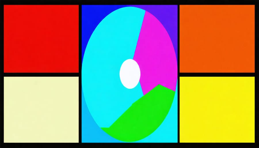
Complementary colors sit opposite each other on the color wheel, and when used together in pond lighting, they create stunning visual drama that can transform your water feature after dark. Think blue and amber, purple and yellow, or red and green – these pairings pack a powerful punch that can make your pond elements really pop.
For example, placing blue lights beneath the water while illuminating nearby foliage with warm amber creates a magical contrast that draws the eye and adds depth to your nighttime display. The blue water appears cooler and more mysterious, while the amber-lit plants feel warm and inviting.
When working with complementary colors, remember that less is often more. Start with one primary color as your base, then add small touches of its complement for accent. This prevents the scene from becoming overwhelming while maintaining visual interest. Try highlighting a water feature with purple light while using touches of yellow to illuminate specific plants or rocks around it.
The real magic happens when these colors reflect on the water’s surface, creating mesmerizing patterns that change with every ripple. For maximum impact, experiment with different intensities and positions until you find the perfect balance for your pond’s unique characteristics.
Monochromatic Schemes
Monochromatic lighting schemes offer a sophisticated approach to pond illumination by focusing on different shades and intensities of a single color. This creates a harmonious and elegant display that can transform your water feature into a stunning focal point after dark.
Imagine your pond bathed in varying depths of blue light – from deep navy in the deeper areas to soft azure highlights dancing on the surface. This layered effect adds depth and dimension while maintaining a cohesive look. You can achieve this by using lights of the same color but different brightness levels, or by positioning similar lights at various depths and distances.
To create a successful monochromatic display, start with your base color in the deepest parts of the pond. Then, add lighter variations of the same hue to highlight specific features like waterfalls or decorative elements. White lights can be strategically dimmed to create softer versions of your chosen color, adding to the monochromatic palette.
Popular monochromatic choices include blues for a serene, moonlit effect; greens for a natural, forest-like ambiance; and warm whites for a classic, sophisticated look. Remember to consider how your chosen color will interact with your pond’s natural elements and surrounding landscape features.
Common Mistakes to Avoid
When it comes to pond lighting color theory, even experienced pond owners can make mistakes that detract from their water feature’s beauty. Let’s explore some common pitfalls and learn how to avoid them.
One frequent mistake is using too many different colors at once. While it might be tempting to create a rainbow effect, this often results in a chaotic and distracting display. Instead, stick to two or three complementary colors that enhance your pond’s natural features and create a cohesive look.
Another oversight is ignoring the impact on pond ecosystems. Bright white or blue lights can disrupt fish sleeping patterns and affect plant growth. Choose warmer tones for general illumination and save cooler colors for accent features.
Many pond owners also place lights without considering seasonal changes. What works in summer might create harsh reflections in winter when foliage is sparse. Plan your lighting scheme with year-round visibility in mind, and consider using adjustable fixtures that can be repositioned as needed.
Using lights that are too bright is another common error. Overpowering illumination can wash out subtle water features and create unwanted glare. Remember, pond lighting should enhance, not overwhelm. Start with lower-intensity lights and adjust as needed.
Finally, failing to test colors during different times of day is a crucial mistake. What looks perfect at dusk might appear washed out or too intense at night. Take time to experiment with your lighting at various hours and weather conditions before making final decisions.
By avoiding these common mistakes, you’ll create a more balanced and visually appealing pond lighting design that enhances your water feature’s natural beauty while maintaining a healthy environment for your aquatic life.
Seasonal Lighting Considerations
The magic of pond lighting truly comes alive when you adapt your color schemes to match the changing seasons. In spring, soft greens and gentle yellows can highlight emerging water lilies and new growth, creating a sense of renewal and freshness. Consider using pale blue lights to enhance the reflection of spring skies on your pond’s surface.
Summer calls for vibrant, energetic colors that complement the peak blooming season. Warm whites and subtle amber tones can make your water features sparkle during those balmy evening gatherings. These colors work particularly well when illuminating waterfalls or fountain sprays, creating a mesmerizing display that captures the essence of summer nights.
As autumn approaches, embrace the season’s natural palette with amber and golden lights that echo the changing foliage. Deep oranges and russet tones can transform your pond into a cozy retreat that mirrors the surrounding fall colors. These warmer hues also create a welcoming atmosphere for evening entertainment.
Winter presents a unique opportunity to experiment with cool blues and pure whites, mimicking the crisp, clean feeling of the season. Ice-blue lighting can create a magical winterscape, especially when reflecting off frozen water features or highlighting evergreen plants around your pond.
For special occasions, don’t be afraid to temporarily switch up your lighting scheme. Festive reds and greens can make your pond part of your holiday decorations, while purple and gold might be perfect for celebrating special events. Remember to always test new color combinations during both day and night to ensure they achieve your desired effect and complement your pond’s natural features.
As we’ve explored throughout this guide, lighting color theory is a powerful tool for transforming your pond into a mesmerizing nighttime display. By understanding how different colors interact with water, affect plant and fish visibility, and create distinct moods, you can craft a lighting scheme that perfectly matches your vision.
Remember that cool colors like blue and green create a sense of depth and tranquility, while warm colors like amber and red add drama and intensity to your water feature. The key is finding the right balance that complements your pond’s natural elements and surrounding landscape.
Don’t be afraid to experiment with different color combinations and lighting positions. Start with a simple setup using one or two colors, then gradually expand as you become more comfortable with the effects. Consider changing your lighting scheme seasonally or for special occasions to keep your pond’s appearance fresh and engaging.
Keep in mind that lighting is both an art and a science. While the principles we’ve discussed provide a solid foundation, your personal preferences and creativity will ultimately guide your choices. Take time to observe how different colors appear at various times of night and how they interact with your pond’s features.
We encourage you to start applying these concepts to your own pond lighting design. With some patience and experimentation, you’ll discover the perfect combination of colors to make your water garden truly shine.